Official Luthiers Forum! http://www-.luthiersforum.com/forum/ |
|
Fully rendered images http://www-.luthiersforum.com/forum/viewtopic.php?f=10102&t=2416 |
Page 1 of 1 |
Author: | LanceK [ Sat Jul 09, 2005 4:33 am ] |
Post subject: | |
A few of you expressed interest in seeing the fully rendered versions of the pictures I had taken a week ago. This is what I did in Photoshop. I have not settled in on a color, but I like the final product. I do have a little tweaking to do around the nut, on the headstock image. Enjoy. ![]() ![]() ![]() |
Author: | Mjoy [ Sat Jul 09, 2005 5:07 am ] |
Post subject: | |
This is much better Lance, truly fine. The darkness of the first set of photos made it difficult for me to judge the woods and design. It has a little bit of that "air-brushed" look that photoshop gives, but provides a much better presentaion of your instruments. --Mark Joy |
Author: | Jeff Doty [ Sat Jul 09, 2005 6:08 am ] |
Post subject: | |
Lance, That's what we're talkin' 'bout! Looks fantastic. Shows off the high quality of your work and the materials that you use. Looks clean, clean clean! Jeff |
Author: | RussellR [ Sat Jul 09, 2005 7:01 am ] |
Post subject: | |
Just one word "Beautiful" |
Author: | EBarajas [ Sat Jul 09, 2005 7:43 am ] |
Post subject: | |
WOW!!!! |
Author: | WalterK [ Sat Jul 09, 2005 10:04 am ] |
Post subject: | |
Lance....!!! You're just a first class act!! Amazing quality. Very nice! Walter ![]() |
Author: | Wade Sylvester [ Sat Jul 09, 2005 10:36 am ] |
Post subject: | |
That's it Lance! That works great. Try tweaking the edging of the head stock image. when you put a darker back color behind it you will notice a light edge against it. If you darken up just the edge of the head stock that is against the dark/shadow back ground, it will look more natural. Sorry, I guess I've been playing with PhotoShop a bit too much. ![]() Keep um comming Lance. Wade |
Author: | RussellR [ Sat Jul 09, 2005 10:43 am ] |
Post subject: | |
HI Lance I didn't notice before but on the headstock image a bit of the nut is missing from the edge of the guitar to the big E string. |
Author: | Brock Poling [ Sat Jul 09, 2005 10:48 am ] |
Post subject: | |
Very nice. |
Author: | LanceK [ Sat Jul 09, 2005 11:47 am ] |
Post subject: | |
Russel, thats how I cut my nuts ![]() |
Author: | RussellR [ Sat Jul 09, 2005 11:50 am ] |
Post subject: | |
Guess it cuts down on resistance and gives you a stronger bass response ![]() |
Author: | CarltonM [ Sat Jul 09, 2005 11:54 am ] |
Post subject: | |
Lookin' good, Lance. I'm guessing you pulled that nut from an air guitar. ![]() Carlton |
Author: | Colin S [ Sat Jul 09, 2005 9:59 pm ] |
Post subject: | |
Superb Lance I'd go with the pale blue myself. There is a small piece under the two treble strings at the soundhole end of the fretboard that needs touching in. I have to say I just love the rosette, really classy, sometimes less is more. Colin |
Author: | Michael Dale Payne [ Mon Jul 11, 2005 7:10 am ] |
Post subject: | |
[QUOTE=RussellR] HI Lance I didn't notice before but on the headstock image a bit of the nut is missing from the edge of the guitar to the big E string.[/QUOTE] Purple back ground reflecting off the highly polished bone ![]() |
Author: | LanceK [ Mon Jul 11, 2005 9:50 am ] |
Post subject: | |
Try this - ![]() And here's another im still working on - ![]() |
Author: | Pwoolson [ Mon Jul 11, 2005 12:47 pm ] |
Post subject: | |
Lance, they look nice but I'll give my .02 worth of critique if you want it. If not, ignore it. 
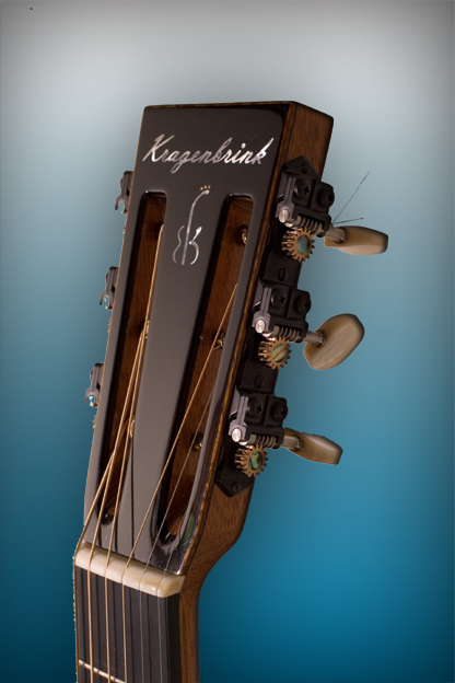
When I was working for a publishing co. I was a photo manipulator so I see things that the "average" person might not see. You've got a white line around a lot of the image. If you blow it WAY up to where you can count individual pixels, you can outline it much better that way. Don't use any of the auto outline tools as they are pretty much worthless. Use the constrained lasso tool and outline it so that there is one pixel cut off. Only one. That will give you a very clean look. Also, I'm not nuts about the purple background. To my eye the background looks more important than the image. The last image is better but I'd still go further with it if I were doing it. The images look great and you definately got your money's worth on the photography. |
Author: | Don A [ Mon Jul 11, 2005 6:16 pm ] |
Post subject: | |
Lance, this is just my personal opinion but I like the first photo with the light blue background much better. |
Author: | LanceK [ Mon Jul 11, 2005 9:27 pm ] |
Post subject: | |
Thanks again guys, Don, I do too, Ive been experimenting with different color backings, my wife likes the aqua too. Paul, great tips! and thanks for the critique! |
Author: | Josh H [ Tue Jul 12, 2005 12:59 am ] |
Post subject: | |
They look good Lance! Hey what kind on tuners are on that slot head? josh |
Author: | Roy O [ Tue Jul 12, 2005 2:43 am ] |
Post subject: | |
Lance, On the picture with the nut you touched up it now looks (to me anyway) that the nut is longer than the fingerboard on both ends. As for background color, I think the Aqua highlights the images better. |
Page 1 of 1 | All times are UTC - 5 hours |
Powered by phpBB® Forum Software © phpBB Group http://www.phpbb.com/ |